above new illustration recently created by Steven Salerno for 7/16/19 issue of The Wall Street Journal
Recently I was commissioned to create another editorial illustration for Lisa DiLillo, art director of the Life & Arts section at The Wall Street Journal. (in the past I was a fairly regular contributor to The Wall Street Journal -for a number of years creating many illustrations for art director Dan Smith) So, it’s very nice this year to be back again creating illustrations for the WSJ and getting to work with Lisa DiLillo.
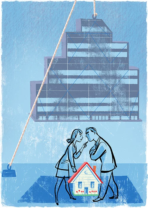
Above is the final completed illustration for The Wall Street Journal assignment, as seen in the printed newspaper on 7/16/19. It accompanies a Life & Arts article about pressures at the workplace that inevitably create a “spillover effect” -causing additional stress and tensions in the home. (name of article: When Stress at Work Creates Drama at Home written by Sue Shellenbarger)
This particular illustration was created digitally in Photoshop, by using various paint brush tools and eraser tools, plus also using some added painted gouache/color pencil textures I created and scanned into Photoshop as well. (I draw on a Wacom Intuos Pro XL digital drawing tablet.)

one of my whimsical illustrations from years ago also for The Wall Street Journal -created for art director, Dan Smith
Daily newspapers are a relentless deadline grind, so it’s totally routine to have only a short time to create the finished illustration -usually just part of a day to resolve and present the sketch, then a day to complete the final illustration.
One of my first clients at the beginning of my illustration career right after graduating from Parsons School of Design (many years ago) was The New York Times. Over a several year period I created many drawings mostly for their Op-Ed Page, and the Letters to the Editor Page. And over the years I have provided many illustrations for other sections of the paper too, but only sporadically. It was for the New York Times where I first learned how to successfully navigate very short daily deadlines, sometimes with the final illustration due the very same day you received the assignment.
THE PRELIMINARY SKETCH STAGE
Below is a description of the various preliminary sketches I developed for this recent Wall Street Journal assignment, which were presented to Lisa DiLillo, art director of the Life & Arts section.
The sketches were created in Photoshop -at the lower resolution of just 150dpi. (NOTE: while working on my preliminary sketches the article my illustration was to accompany was still being written, so my concepts were based on a brief synopsis describing the main points to be addressed in the final article.

(sketch version 1)
above is the very first rough sketch created just for myself to get the ball rolling… one which I did NOT show to the art director -because it was just too obscure and busy, not focussed enough. My intended idea was of a couple arguing at home after their work day -with their “home” being a boxing ring shape metaphor also abstractly being a “house” shape too, with their two workplace office buildings squeezing in from the left and right.

(sketch version 2)
above is the 2nd version sketch which also was NOT shown to the art director. In this version I merely pushed the boxing ring metaphor further by dressing the couple in boxing gloves.

(sketch version 3)
above is the 3rd version sketch. In this version instead of showing the whole shape of the boxing ring, I opted to just show one corner of the boxing ring representing the peak of a house, with just a hint of corporate office buildings in the background. The idea is that the pressures of work are always present and the cause of added conflicts at home.

(sketch version 4)
above is the 4th version sketch. In this version I eliminated the boxing gloves… figuring that actually depicting boxing gloves and the boxing metaphor was an unsophisticated concept and would not be approved by the art director and editors anyway. Because even hinting metaphorically at the suggestion of physical altercation between people, especially with a woman, will understandably be seen as a poorly chosen metaphor which only perpetuates a harmful dynamic.

(sketch version 5)
above is the 5th version sketch. In this version I also eliminated the boxing ring metaphor completely… and simply depicted a couple looking stressed out and uncommunicative perched atop their home, with the office buildings still looming in the background.
(sketch version 6)
above is the 6th version sketch. In this version felt that the point of the workplace pressure being a dominant factor was not clear enough, so I created larger office building shapes on the left and right putting the squeeze on the couple, seen at home projecting this stress onto each other…

(sketch version 7)
above is the 7th version sketch. In this version I changed the position and pose of the two characters so that they are now back to back atop their home…

(sketch version 8)
above is the 8th version sketch. In this version I felt that the important point of the pressures from the workplace was still not being emphasized enough so here I literally placed the office buildings onto the backs of the stressed out couple… extra baggage that is like the psychological straw that breaks the camel’s back…

(sketch version 9)
above is the 9th version sketch. In this final sketch version I felt that having the heavy office buildings as a burden on the backs of the two characters was ultimately too easy and and not really graphically interesting enough… so I moved on to the concept of having the couple arguing at home, and the large office building depicted as a large heavy weight hanging just above their heads casting a dark shadow over their home. (NOTE: it was at this point in time I learned that the dimensions for the illustration appearing in the newspaper would be a vertical shape, which is why this sketch #9 was changed to a vertical shape.)
I emailed my official preliminary sketches (#3’s through #9) to art director Lisa DiLillo for her to evaluate. Lisa got back to me indicating that she and the editors involved had selected my sketch version #9 -depicting the concept of the heavy office building weight hanging over the arguing couple’s heads. Perfect! This was the sketch I felt was the more compelling concept and most interesting graphically anyway. I was glad this was the sketch I’d now be developing as the final illustration!
THE FINAL ILLUSTRATION

above is the FINAL completed illustration that was presented to WSJ art director Lisa DiLillo…
specs: The final illustration was created in Photoshop in RGB color mode and at a 300dpi resolution. It is approximately 9” high x 6.5” wide, the same size that it will be printed in the newspaper. It was composed in about 15 layers, each layer consisting of the various elements and textures comprising the illustration. (see Photoshop screen shot further down in the post)
You can see in the final illustration above that it follows the approved sketch very closely but the line work and quality in the drawing of the couple is much more refined and concise now… the little house is more detailed too compared to the sketch, and even the office building in the final illustration, though purposely “loose”, is now a bit more refined in execution compared to the roughness seen in the sketch. And the upper sky area of the final illustration has a more refined and deliberate texture now (which was created with colored pencils and scanned into Photoshop).
REQUEST FOR A REVISION
Once Lisa DiLillo and the editors reviewed my final illustration, Lisa came back with the constructive comment that they all felt the “office building” hanging above the couple’s heads looked too much like an old factory or old railroad building, and needed to look like a modern glass & steel office building. As soon as I read Lisa’s comment I immediately concurred. Logically the building in the illustration should definitely look like a modern office building! I had clearly missed the mark on this feature. So I had to spend a couple more hours modifying my illustration and draw a modern office building then insert it into the illustration replacing the “old” looking building. It is these last minute modifications that having created the illustration digitally in Photoshop is a distinct advantage! Because the illustration in Photoshop is created in a hierarchy of multiple individual layers, thus allowing me to easily swap out the old building with the new building without affecting the background layer at all.
Below is the REVISED FINAL ILLUSTRATION which has the “modern glass & steel office building” inserted into the composition… This is the final version which appeared in the newspaper.

above is the FINAL APPROVED ILLUSTRATION which appeared in 7/16/19 The Wall Street Journal printed newspaper edition.

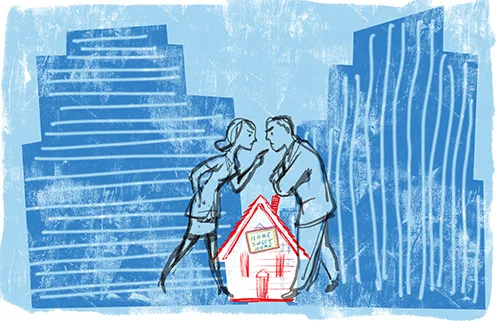
above is a detail of the FINAL ILLUSTRATION -the stressed out couple arguing. I drew the couple using a brush tool in Photoshop emulating the look of an ink line that bleeds very slightly…

above is a detail of the FINAL ILLUSTRATION -the stressed out couple arguing.

above is a detail of the FINAL ILLUSTRATION -the office building hanging above the couple.
The last aspect of the illustration assignment created for Lisa DiLillo, art director of the Life & Arts section of The Wall Street Journal was to also create an extra alternative format version of the illustration which was used only in their on-line version of the newspaper, WSJ.com. It needed to be horizontal in format, so I had to reconfigure the composition and truncate the height of the building hanging above the couple’s head in order for it to fit within the shallower space. (see below)

above is the on-line alternative format horizontal version of the FINAL ILLUSTRATION as seen on wsj.com
Visit stevensalerno.com to view many more features on my illustration work for magazines and advertising, as well as my many popular picture books for kids, too!